Tuesday, 23 October 2018
Privileged preview: Stockholm's Nationalmuseum
A more pompous term for it would be 'VIP visit', but what's for sure is that the large group of international journalists present in Stockholm for the Birgit Nilsson Prize ceremony had huge privilege in being given a tour of the Nationalmuseum prior to its public reopening after five years of renovation and reconstruction. Here's the west facade seen from over the bridge, complete with a weekday morning exercise group.
I'm assuming the original idea was to have the sparkling, colour-filled redesign launched 150 years after the original opening on 15 June 1866, when the first exhibition drew more than 90,000 visitors in a city of 115,000 inhabitants, but presumably the work took longer than expected. Anyway, here it all is for the world to admire - a curious collection famous above all for its Rembrandts, including a personal favourite, The Song of Praise of Simeon in the Temple painted in the last year of Rembrandt's life, seen here to the left of the vast and peculiar canvas The Conspiracy of Claudius Civilis which reminds me more of contemporary artist Ken Kiff.
We were lucky to be led, for half of the tour, by Helena Kåberg, project manager of the art collections, seen here beneath Balder the beautiful.
The priority, as she puts it in an interview for the 'Reopen' brochure, was "the lighting and the colours. One of the main principles underlying the new approach to displaying art collections is to use daylight in the galleries. It has been a challenge to handle the daylight flux and complement it with artificial light to create varying experiences'. Our morning, though it quickly gloomed, had started out bright, so the filtering screens were down, but still allowed for views across Strömmen to the Royal Palace.
The colours had been part of German architect Friedrich August Stüler's plans, but the Swede Fredrik Wilhelm Scholander who took over was more conservative. Many of the present schemes revert to Stüler's ideas. They work especially well, I think, in the 18th century French room (two Watteaus on the right here)
and the lilac matches the rather ugly vase in this assemblage.
Once 1950s whitewash had been removed, many of the domes in the ceiling looked like the one furthest away here, which was left as revealed while the rest were repainted and modern essentials like air conditioning and a sprinkler system were installed in the roses.
The Nationalmuseum's miniature version of the Great Court at the British Museum is the Sculpture Courtyard, which is probably the first room visitors enter once up the steps from the entrance. A new dome has been inserted
while the idea in what could well - but hopefully won't - be marketed as 'an ace cafe with a good museum attached' aims to attract families with affordable fishy tapas by a leading Swedish chef Fredrik Eriksson, who laid on a selective but insanely delicious spread for us.
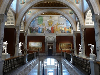
But I leap ahead, mouth watering. After the gathering in the sculpture court, we were divided into two groups. My lot headed to the top floor (see lead pic), to be immediately dazzled by the lighting, especially of the sculpture casts in the niches - Laocoon has never looked so good -
before heading into the picture collection. Its core was assembled by Count Carl Gustaf Tessin (1696–1770), who doesn't seem to have gone that far back into the past; the earliest top notch paintings in the first room are by the Cranachs, including one of the many portraits of Luther
but then, via an exquisite gathering of Rembrandt drawings, we hit the big guns, including these portraits as well as the Biblical canvases depicted above.
After time in the French collection, we rejoined Helena downstairs in the 19th and early 20th centuries, as it were, and moved through the mixed showings of native and international art. It was good to see beloved Liljefors, the best of nature painters, in two works reunited with their original Japanese-style frames.
In a nice parallel to our own V&A, there's a big room of 20th century Swedish interiors with a fabulous and colourful array of designs.
The first big exhibition of the newly-opened building is devoted to John Singer Sargent, with some well-known loans including the National Portrait Gallery's Henry James, second along in the row here,
and comparisons with Sweden's own JSS, Anders Zorn, as here (the Zorn on the left).
I'd be prompted to think more of that great turn-of-the-century collector and gay icon Prince Eugen when I revisited Waldemarsudde, a superb bequest to the nation, in brilliant sunshine the following day. Hungry for more inside, though, on our grey day, I walked over the bridge to the museum island of Skeppsholmen and spent several happy hours in the Museum of Modern Art - a fine collection, but that had better wait for another time.
Subscribe to:
Post Comments (Atom)


9 comments:
Many artists flatter the physical appearance of their sitters, but John Singer Sargent flatters their intelligence
Do you think he makes Lord Ribblesdale (on the right in the photo) look intelligent? The portrait struck me as the epitome of aristocratic arrogance, possibly mixed with stupidity. You can imagine him whipping his horses and possibly his servants.
The Japanese framing of the Liljefors reminds me of a painting at Ainola. I seem to recall in one frame a painting of Sibelius, another with perhaps a bit of garden, and one panel left with nothing in it, I think meant to accommodate a bit of musical score? Well, memory probably deceives me, but the frames you noted called it to mind. The room with Swedish interiors looks to be full of interest. The piano is certainly unusual, and I liked the look of the paintings in the background in the first of your photos of the interiors room. Interesting, too, to get a glimpse of the thinking behind the redesign—handling the vagaries of natural light, and the choice of colors. The results do look quite appealing, and yes, the food does look to have been awfully good!
Spot on, Sue: that was Akseli Gallen-Kallela's great triptych missing, as you say, the third panel. Usually the portrait of Sibelius is seen in isolation; the Japanese flowers are a surprise. Photo of it in situ - amazing it wasn't carted off to Helsinki - is here: http://davidnice.blogspot.com/2010/03/sibelius-at-home.html
And indeed, art first, food a close second...
That's it--Gallen-Kallela! And of course it was on that very blog post of yours that I first learned of the triptych and what the missing panel was to have contained.
Yes Lord Ribblesdale is arrogant and might well use the whip, but that does not make him less than intelligent ( unless you define intelligence as being balanced and sensible). Also, look at some of Sargent's other portraits
Was. Do you know about him? I don't get much sense of intelligence from the portrait. And some of Sargent's other subjects look self-satisfied and silly.
Many thanks once again for taking me places I would not otherwise be. Hope you got my email?
Those Swedish interiors were intriguing, particularly that piano.
Sorry, Will, yes, was just waiting for some spare time to reply properly. Thoughts with you.
Post a Comment